FaceValue

Product strategy, UX, brand & agentic delivery

Founder

A founder-led concert intelligence platform with 14M+ organic social views, 686K+ interactions and shares, and press citations for its pricing analysis.
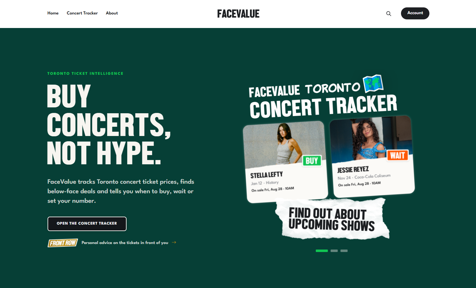
I founded FaceValue, a Toronto concert-ticket intelligence product and media brand. It has earned 14M+ organic social views, more than 686K interactions and shares, 217K website impressions, and a 78% average newsletter open rate. Its original pricing analysis has become a source for Do Not Pass Go, Exclaim!, and 99scenes.

I lead the product strategy, research, UX, brand, content, data model, and day-to-day workflows. I also direct the agentic development process used to build and run much of the system.

Visit FaceValue ↗ · Open the Concert Tracker ↗ · Instagram ↗ · TikTok ↗

Making ticket prices easier to act on

Ticket buyers are asked to make expensive decisions with incomplete context. The original price is hard to find, inventory changes quickly, and every onsale is framed as urgent. FaceValue turns that uncertainty into a direct recommendation: Buy, Wait, or Tossup. Each recommendation is grounded in original face-value prices, current listings, venue sections, sales pace, and historical patterns.

The Concert Tracker brings discovery and decision support together. Fans can find newly announced shows, compare current prices with face value, see recommendations by section, mark shows as Interested or Going, and set a personal price target. I designed the experience around progressive disclosure: a clear recommendation first, section-level evidence second, and personal controls when the user is ready to track a show.

The public product connects discovery, recommendation evidence, and personal price monitoring in one system.

Behind the tracker

FaceValue is not maintained by manually posting isolated updates. I designed an internal system that discovers concerts, tracks onboarding and data quality, compares primary and resale prices, proposes qualified deals, and routes exceptions for review.

The review feed brings price movement, inventory, historical pace, recommendation confidence, and publishing state into one decision surface. Automation handles collection and repetitive production; I retain human approval over recommendations and what reaches the audience.

Once I approve a deal, FaceValue can create a branded social card and send a subscriber alert from the same verified data. I do not need to re-enter the same information for the tracker, social channels, and email.

Automation handles the repetitive work while I review the decisions and audience-facing output.

Working with AI as an implementation partner

I use Claude and Codex as implementation partners. I break work into clear tasks, document the relevant product context and constraints, and review what they produce. They help me build across the front end, back end, data pipeline, email, SEO, and internal tools. I still make the product decisions, test the work, and decide what ships.

This lets me move faster without handing over judgment. Anything that can affect trust, including verdicts, data exceptions, editorial claims, and releases, stays reviewable and reversible.

Turning product data into editorial authority

FaceValue has grown without paid acquisition. I developed repeatable formats for price comparisons, deals, verdict reporting, newsletters, and practical guidance. Each one turns original data into a story fans can understand, verify, and share, then gives them a reason to use the tracker.

My long-form guide, How to Win the Ticketmaster War, translates repeated real-world experience into practical advice for buyers. FaceValue's reporting has also been cited by Exclaim! in its coverage of Stella Lefty's ticket prices.

Original analysis becomes useful consumer guidance, recognizable editorial work, and evidence of real savings.
Canada Revenue Agency

UX research · Service workflows & accessibility

UX Specialist

Embedded research across 21 internal products, leading 15+ mixed-method engagements that informed roadmaps, feature scope, and workflow improvements.

I worked as an embedded UX researcher on a cross-functional team improving digital tools and internal workflows for Canada Revenue Agency contact centre agents. Across 21 products, I led more than 15 mixed-method research engagements that informed roadmap direction, feature scope, and workflow improvements.

This work involves protected internal systems. I can discuss my responsibilities, methods, and influence on product decisions, but I cannot share project names, interfaces, participant data, or research artifacts.

Scope at a glance

  • 21 internal products serving complex contact centre workflows
  • 15+ research engagements spanning discovery, evaluation, redesign, and modernization
  • Mixed methods including moderated usability testing, cognitive walkthroughs, heuristic evaluations, interviews, and benchmark studies
  • Decision-making audiences ranging from project managers and delivery teams to directors and senior leadership

From an ambiguous problem to a research plan

I partnered with product managers, designers, developers, subject-matter experts, and operational stakeholders to decide where research could have the most value within government timelines and compliance requirements. Projects often began with broad concerns about a workflow or proposed feature. I translated those concerns into focused research questions, participant criteria, test scenarios, and practical study plans.

My work included planning multi-phase studies, mapping complex agent workflows, preparing and counterbalancing tasks, recruiting and scheduling participants, moderating sessions, observing tests led by other researchers, and reviewing findings across the team. Depending on the product's maturity, I selected methods that could clarify an early direction or evaluate an experience already in use.

Turning evidence into product direction

I combined behavioural observations, participant feedback, task performance, and expert evaluation into clear findings. Reports went through multiple reviews for accuracy, then translated detailed evidence into prioritized recommendations and actionable next steps.

I presented findings at both strategic and technical levels. Research regularly redirected product decisions, changed feature scope, and exposed workflow issues that teams could address in their roadmaps. Low-fidelity prototypes and flow maps helped make recommendations concrete enough to discuss, test, and implement.

Accessibility in every engagement

Federal accessibility requirements were part of the work from the beginning, not a final compliance check. I applied WCAG standards throughout research and design engagements, including study planning, heuristic reviews, prototypes, and recommendations. This helped teams consider accessibility alongside usability, operational constraints, and delivery risk.

Building research capacity

Beyond individual projects, I mentored junior researchers and designers, facilitated design workshops, and wrote reference guides that were adopted across the team. I also created internal material explaining the value of UX services for departmental planning and stakeholder outreach.

The role strengthened my ability to lead research across a portfolio rather than a single product: finding the right level of evidence, communicating it to different audiences, and helping teams make better decisions under real organizational constraints.

Corporate Renaissance Group

B2B product design · Web & visual communications

UI/UX & Graphic Designer

An enterprise software redesign spanning requirements, 60+ desktop screens, front-end implementation, product marketing, and supporting sales materials.

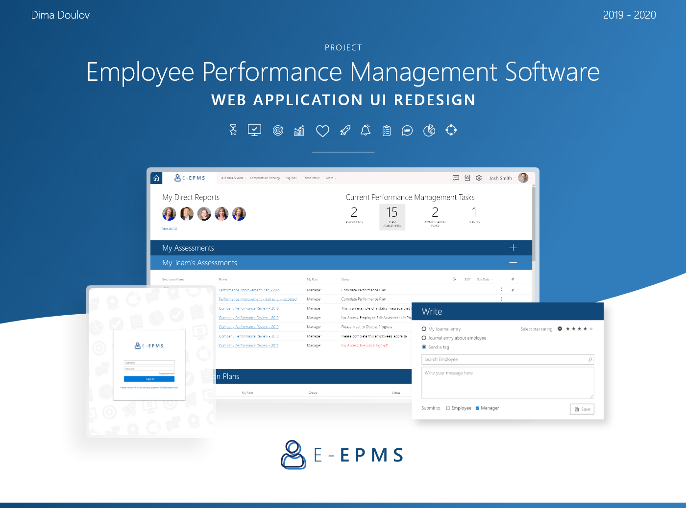
At Corporate Renaissance Group, I worked across product design, web, and visual communications. The centrepiece was a redesign of the company's employee performance management platform: more than 60 desktop screens, a reusable interface system, working front-end prototypes, and close collaboration with management, support, and development. I also carried that product story into its landing page, print advertising, and sales materials, while contributing to the wider CRGroup brand.

The original presentation uses E-EPMS as a confidentiality alias for the product. That alias is retained in these published visuals.

E-EPMS: redesigning a complex B2B product

I gathered requirements with my manager and drew on the product and support teams' accumulated knowledge of users. We separated requests into visual changes, smaller functional improvements, and larger product changes. The first release focused on the first two, while responsive design was reserved for a later phase.

I adapted Microsoft's Fluent visual language to CRGroup's brand, using Segoe UI, a shared component library, consistent status colours, and client-customizable primary colours. I turned the system into more than 60 desktop mockups, reviewed the work with stakeholders, implemented key flows in HTML, CSS, and JavaScript on a test site, and coordinated with the development team in India for integration.

Three interface decisions

  • Home dashboard: Collapsible sections helped managers focus on the assessments and tasks that needed attention instead of scanning every table at once.
  • Employee appraisals: Clearer separation between navigation, progress, and form content made a dense workflow easier to read.
  • Ongoing feedback: I reorganized the tag wall into a single-column, collapsible layout and added a persistent shortcut for writing feedback from other pages.

Taking the product to market

The redesign did not stop at the application. I designed an E-EPMS landing page around a clear demo request, then translated the same visual language into product advertising and sales material. This made the experience feel consistent from the first campaign touchpoint through to the software itself.

A broader in-house design role

Alongside the product work, I created social media cards, postcards, print ads, information one-pagers, campaign landing pages, and event material for CRGroup and its product lines. The range mattered: I could move from a detailed enterprise workflow to a sales leave-behind or campaign asset while keeping the message and visual system connected.

View the complete assorted design work board

The original UI redesign presentation is also preserved as six full-size panels: , , , , , and .

mont remo.

Brand identity, websites & e-commerce

Co-founder

A small digital marketing agency I co-founded, with client work across identity, websites, e-commerce, and campaign design.

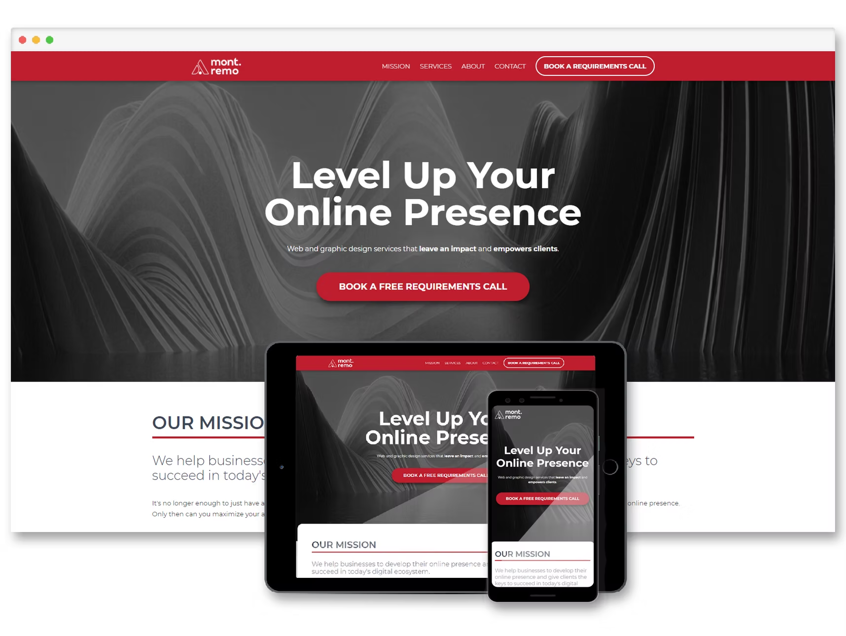
Mont Remo was a small digital marketing agency I co-founded in 2019. I led client design work across brand identity, websites, e-commerce, and campaign materials, taking projects from early direction through production in Webflow, WordPress, and Shopify.

The work called for the same underlying practice in very different contexts: clarify the client's offer, establish a usable visual system, and carry it across the touchpoints people actually encounter.

Lasting Impressions Hair Salon

The brief was to replace an outdated web presence with a clearer way to present the salon's services and receive appointment requests. I presented three directions, then built the selected responsive design in Webflow. The appointment-request form fit the salon's existing booking process, and I extended the visual system into social and print advertising, window graphics, and a roadside sign.

Do U Love Music

I helped my dad bring his music retail business online. I defined the storefront identity, built the Shopify experience across desktop, tablet, and mobile, designed business cards, and created reusable email templates for customer communication.

Storefront identity and responsive shopping experience.

Deserted Darlings

For this vintage clothing store, I developed the identity from exploratory wordmarks through a final logo system. I delivered a practical package with 45 exported files, editable source files, and a reference guide so the client could use the mark consistently.

Logo explorations and applications across packaging, labels, and apparel.

Bockstops

I created a logo and custom one-page Webflow site for Bockstops, a new music label. The design used a deliberately tactile, editorial visual language to connect the label's identity with its social presence.

Bockstops' identity and one-page website across devices.

Mont Remo's own site

I also designed and built Mont Remo's own website to explain our services and present our work.

The agency website used to explain our services and present client work.

Clone Hero

Game UI · Product design & community collaboration

UI/UX Designer

Core interface and launch design for a community-built rhythm game with 200K+ monthly active players.

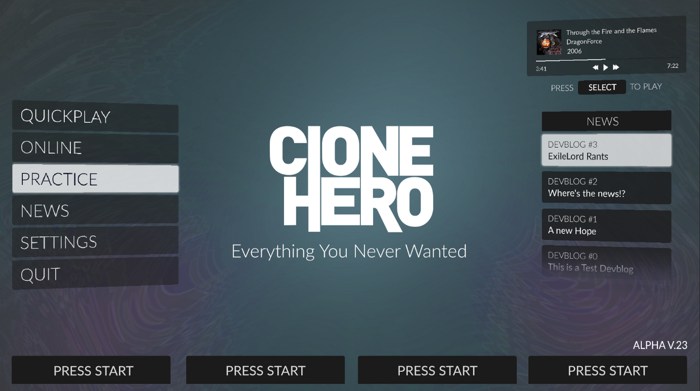
Clone Hero is a community-built rhythm game with more than 200,000 monthly active players. I joined its volunteer team as an artist in early 2019 and helped redesign the menus players use to start sessions, find songs, and manage the game. As a longtime rhythm-game player, I was designing for a community I already understood and participated in.

Visit Clone Hero · Watch the launch trailer I created

Redesigning a core player experience

Filyng and I redesigned the menu structure, iconography, and visual system, with David implementing the work in Unity. We had to make a large song library easier to browse without losing the speed and familiarity experienced players expected. The new interface shipped in September 2019.

I also created the launch trailer, giving the team a clear way to introduce the release and show the redesigned experience in motion.

Designing with an active community

My contribution extended beyond the shipped interface. I created player-help graphics and assets for community tools, discussed drum-mode needs with experienced players, and helped start conversations around future branding. I also participated in the release's Reddit AMA and ongoing Discord discussions.

That feedback loop connected the design work to newcomers, experienced players, moderators, and content creators. It was not a formal usability study, but it gave us direct access to the people using and extending the game. The work taught me how to improve a familiar product without treating an established community as an obstacle to change.

Historical branding exploration for StrikeLine. This is design exploration, not a current release plan.

Creative Interactions Lab

Carleton University · HCI research & physical prototyping

Research Co-op

Bendable game controls, prototypes for accessible interaction research, and web and communication tools for a university lab.

During my eight-month co-op term at Carleton University's Creative Interactions Lab, I worked alongside researchers in deformable interaction, including Dr. Audrey Girouard. My contributions spanned software development, physical prototyping, and communication design.

Bendy Boosters

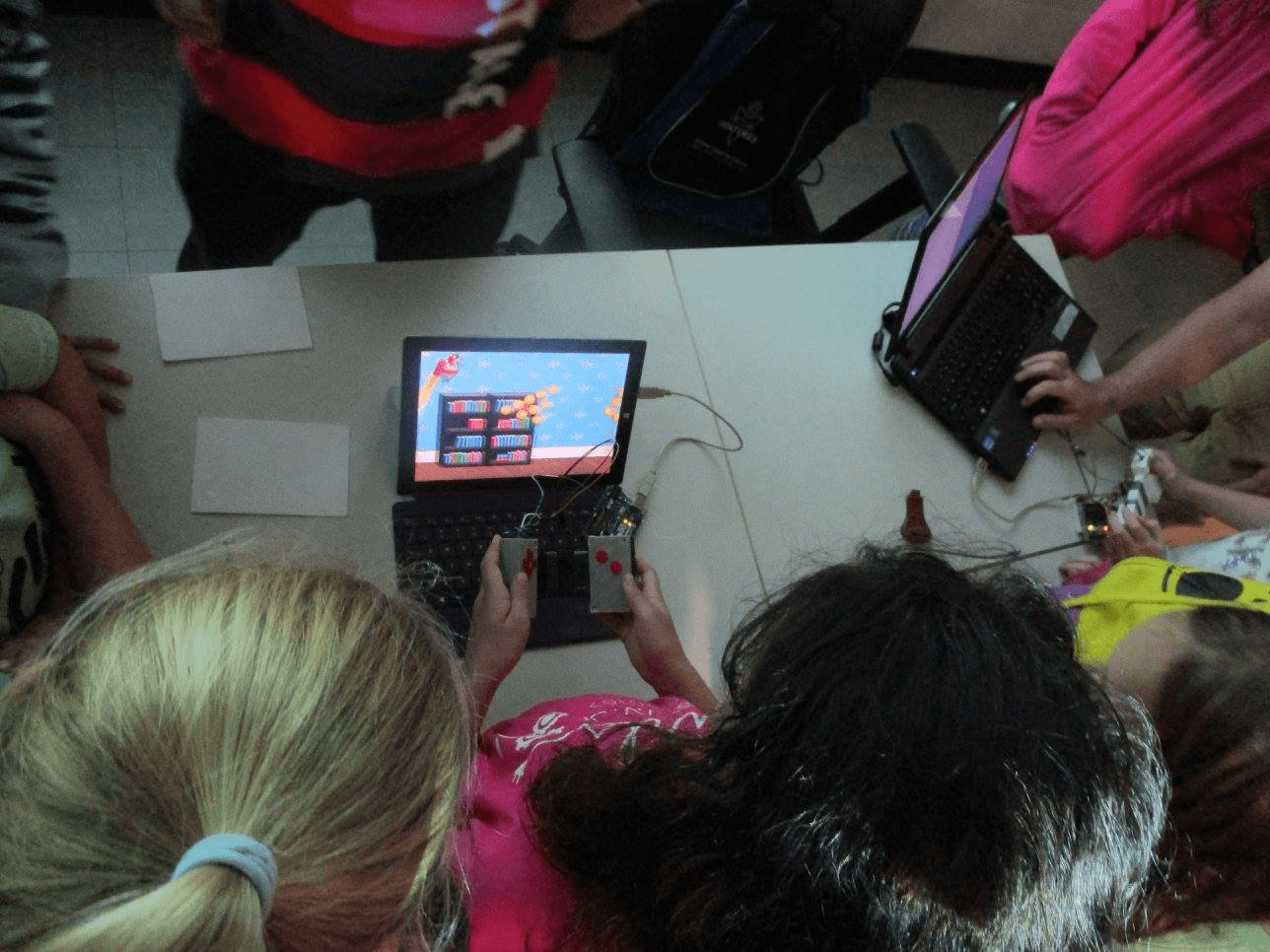
I adapted an open-source endless runner to the lab's Bendtroller using Arduino and Unity. Bending the controller controlled the character's jet thrusters and releasing it let the character fall. The amount of bend provided continuous control, rather than a simple binary input.

The lab's Bendtroller, used as the input device for Bendy Boosters.

Bendy Boosters is the world's first fully analog bendable game. Students used it during Carleton's Virtual Ventures engineering camp, giving the lab a concrete way to demonstrate deformable interaction through play.

The game was demonstrated to students at Carleton's Virtual Venture engineering camp.

BendyPass prototyping

I collaborated with master's student Daniella Briotto Faustino on bendable devices for people with visual impairments. I designed, modeled, and 3D-printed molds that were cast in silicone. Daniella gathered user feedback, which informed the rapid prototype revisions I made with her.

Molds and silicone casting used in the prototyping work.

Web and lab operations

I redesigned the Collaborative Learning in Usability Experiences (CLUE) website within Carleton's CMS guidelines, inventoried the old sitemap, created an event-submission form, and wrote documentation for future administrators. With a coworker, I also redesigned the lab's inventory system in Trello. Other work included a printed recruitment card for conferences and networking events.

Dating App Usability Analysis

UX research · Prototyping & usability testing

Researcher

An early UX study of Tinder and Bumble, connecting product analysis and user testing to specific interaction recommendations.

For an Aspects of Product Design Methodology course, I contributed to a comparative study of Tinder and Bumble. My work covered product analysis, interaction modeling, research planning, usability testing, and interface recommendations. It was an early example of the UX approach I still use: understand the system, observe real behaviour, and turn evidence into design direction.

Completed January to April 2018. This is a historical student study of the products as they existed then. It was not client work for Tinder or Bumble and is not an assessment of their current products.

Analyze the products

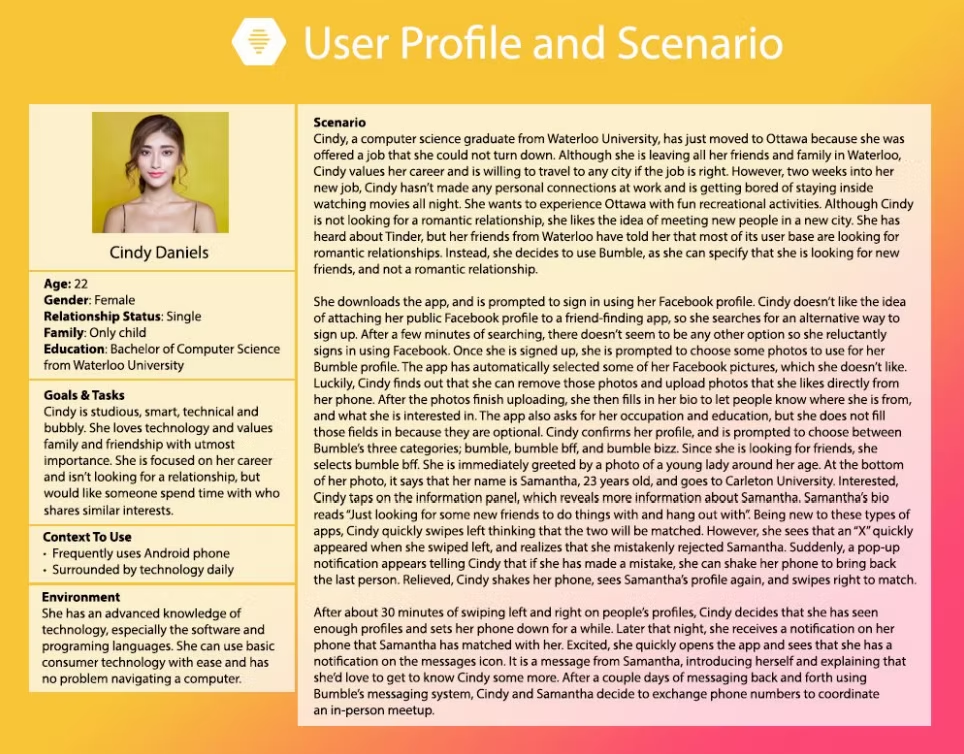
I mapped each product's core functionality, created population-segmentation and user-profile material, and helped define usability goals and evaluation criteria. I then evaluated both products against Nielsen and Molich's interaction heuristics, documenting specific issues with recovery, density, discoverability, registration, and matching constraints.

Design the test

I helped turn the research questions into a repeatable study with pre-test questions, think-aloud tasks, timed activities, and a post-test questionnaire. Five participants completed the same scenarios for both apps, with product and scenario order swapped between participants. The tasks focused on changing matching preferences, recovering from mistakes, and understanding like and dislike gestures.

The wireframes made the research questions concrete through proposed flows for matching, undoing a swipe, and changing settings.

Turn findings into directions

The results combined participant comments with simple comparisons of ease, preference, and satisfaction across the two products.

  • Make preferences findable: participants confused profile editing with matching preferences. We proposed a dedicated filter control on the matching screen.
  • Make mistakes recoverable: undo controls and payment restrictions made recovery difficult. We proposed a history of liked and disliked profiles as a more flexible recovery path.
  • Support more than one input model: some participants used buttons alongside swipes. We recommended keeping both interaction modes so people could choose the input that made sense to them.

The proposed directions were made concrete in interface concepts for filters and swipe recovery:

Because this was a small class study, the recommendations were not validated through a live-product release. The value of the project is in the practice: defining a question, observing behaviour, and tying recommendations back to evidence.

Supporting materials

The original reports and final presentation document the analysis, goals, heuristic evaluation, findings, and recommendations.

Final presentation: Dima Doulov, Kenny MacDonald, Yui-Jhun Ng, Kyte Spence, and Genevieve Zoratto. James Lee is also credited in the initial product-analysis report.